Overview
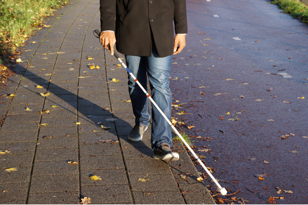
Blindness is an umbrella term used for lack of vision. This expression may also generally include partial vision loss. Partial blindness means a person has minimal vision. Total blindness is a complete lack of sight and the inability to see any light. For this chapter, when we use the term blindness, it means total blindness.
According to the WHO, vision impairment is classified into two categories, distance and near vision impairment.
Distance vision impairment:
- Mild –visual acuity worse than 6/12 to 6/18
- Moderate –visual acuity worse than 6/18 to 6/60
- Severe –visual acuity worse than 6/60 to 3/60
- Blindness –visual acuity worse than 3/60
Near vision impairment:
- Near visual acuity worse than N6 or M.08 at 40cm.
Blind people “read” by listening to text through a text-to-speech software called Screen Readers. Screen readers are software that converts the text on a web page into audio. This is a great accessibility feature for people with impaired vision. Screen readers can be downloaded from various sites and used with most computers and phones.
Designing for the blind-
Provide text alternatives for non-text content (Hint: alt text for images) – Screen readers cannot read graphics and images without the alt text.
Use appropriate structure and semantics in content markup (Hint: headings, landmarks, tables, lists) – Screen readers read out headings, landmarks, and other semantic elements to aid the user in understanding what is on the page. They can also navigate a web page by skipping directly to the main content landmark or a specific heading.
Test functions to ensure they are available using the keyboard only ( Tip: Testing with the screen reader is helpful since there are be sure to test with the screen reader turned on because there are minor variations in how the keyboard interacts with the screen reader when it is running) – As blind users cannot see where the mouse pointer is, while being able to use a mouse, it is more practical for them to use the keyboard instead.
Don’t rely on color alone to convey information (Hint: color of text, background) – Screen readers cannot read all the visual information on a webpage. Screen readers do not provide information on color or background layouts, if at all.
Feedback must be provided through their screen readers after every action performed. Some examples of feedback include values that may have changed on a slider, status of form submission, notification of a new page load, expand or collapse in a section.
All features are required to be clicked on mobile devices – (Tip: Actions that require custom swipe motions on mobile web pages are not compatible with screen readers). This means that all controls need a click action to work with a screen reader for blind people and not swipe actions like sighted users are used to performing.
Custom control features must-have HTML or ARIA name or a label (Hint: expand/collapse buttons, media player control, and dialogs). They must also have an assigned value that must change when applicable (e.g. aria-expanded= “false” changes to aria-expanded= “true” upon user interaction ). Custom controls are unlike native HTML elements in that they have no semantic markup, so screen readers can’t identify what the element is and interpret that to the user. This is why it is vital to apply names, roles, states, and properties through ARIA.
All videos with audio require transcripts or audio descriptions to understand the video. Blind users can hear the audio in a video that includes narration and other sounds, but they cannot physically see the video. It can be essential to use audio descriptions for vision-impaired people to grasp what the video conveys fully. Audio descriptions contain details that cannot be understood from the main soundtrack, such as natural pauses in dialogue or certain accents and character changes.


