MJ Design is a graphic design studio driving with the purpose of building brands that impact millions of lives.
They pride themselves on delivering exceptional and meaningful experiences to their customers.
After working with tier 1 companies in print media and eCommerce, Michele Jenkins (MJ) founded the company and put together a multi-disciplinary team.
Discovery
The owner of MJ Design studio approached us to expand and move away from her Squarespace site. From Day 1, we indulged ourselves in understanding MJ Design and its work.
The pivotal principle for this project was to build an engaging, accessible, and WCAG 2.1 Level AA or higher compliant website with the best UX practices.
Apart from the accessibility requirement, the project requirements included:
More customer acquisition
A content-rich website providing in-depth insights into the graphic designing domain.
Integrate the ‘Work portfolio’ section
A concise, timely, appropriate CTA pop up
Aesthetically pleasing templates
Better brand awareness and visibility
All these factors became action points to execute the strategy and development phase of the project.
Strategy
With clear goals, we aligned them with a creative vision to make MJ Design more robust in the coming years. Building everything from scratch meant that we needed to focus more on making the website more impactful.
During the wireframing phase, the strategy predominantly revolved around making the website aesthetically pleasing, accessible, and easy to navigate, with the customer acquisition revolving around email subscriptions.
Adding a ‘Call us for a free consultation’ CTA allowed more leads to convert and made them enter the first stage of the sales funnel.
Accessibility was the driving principle throughout the strategy phase, intending to make the MJ Design website searchable by humans and search engines.
Build
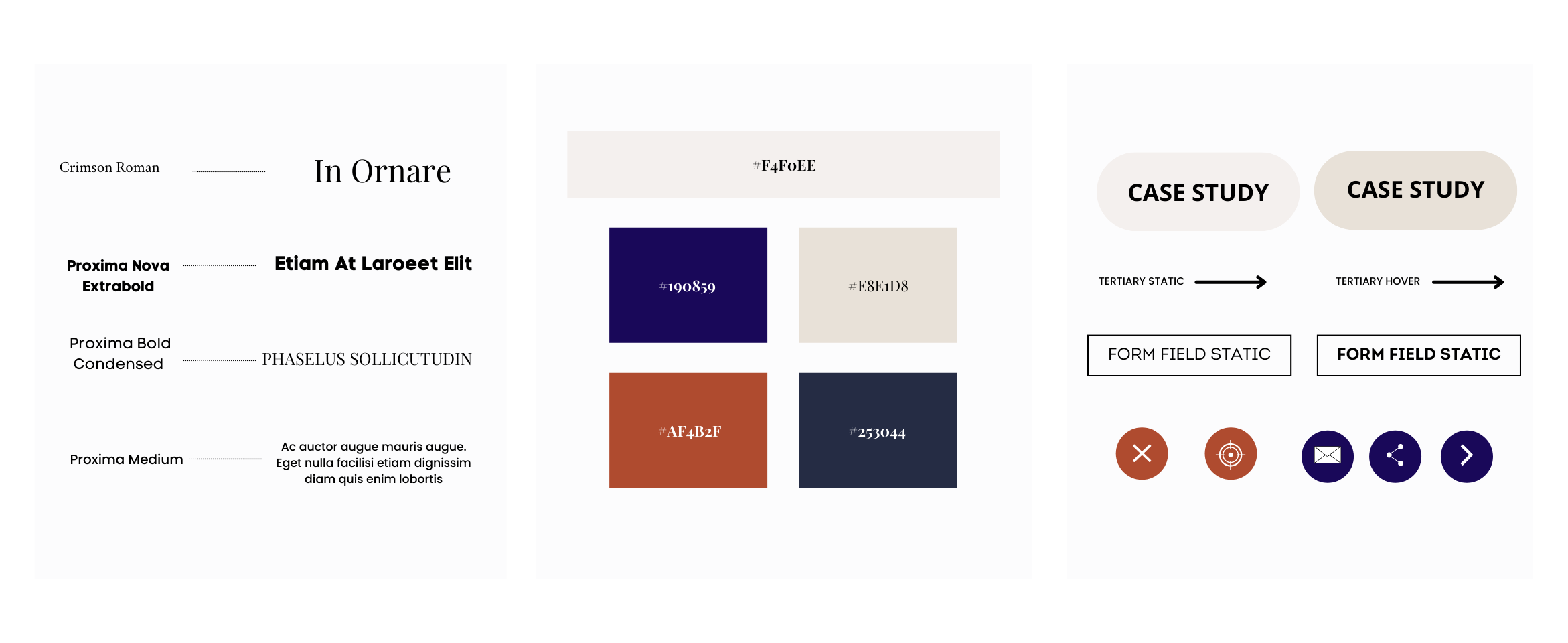
After formulating the UX strategy, we started working on the design and wireframes. Fonts, images, and built-on colors were organized systematically by our team to make the website look pleasing to the eye at first glance. The color palette and brand guidelines were provided by the client.
The website was built using WordPress, and CMS was curated for the client to have complete control over the website, which was her fundamental reason for migrating from Squarespace.
To achieve design consistency, the infrastructure of the website was organized with navigational landing pages.
Pages were templated in order to avoid breaking accessibility and keep navigation consistent.
The placeholder content was replaced with live content from the client and the page templates underwent a round of accessibility and usability testing with a screen reader to see how they interacted with interactive elements on the layout.
Once we got the nod from MJ on how the layouts and content interacted with the design, we were ready to take the site live.
Test & Launch
Once the development was completed, we worked meticulously to test MJ Design’s website.
During the testing phase, we tested the website on Safari for Mac and Chrome on Windows 10 to ensure seamless accessibility and functionality testing. Mobile browser testing was also conducted on the respective operating systems.
Once we were confident that there were no bugs, we took a backup from the staging server as per our best practices and went live.
We trained our clients on the CMS and gave them time to adapt.
Usually, in the case of rebranding, we would review the old site’s analytics and select a preferable time to launch the website. However, as MJ Design was a brand new website, we launched the website on a schedule that aligned with the client’s social media launch.