ARIA stands for Accessible Rich Internet Application. ARIA is a collection of attributes and roles that act as add-ons to complement HTML for complex web applications, particularly those built using Javascript.
It helps make the applications accessible for assistive technology that is otherwise not possible with the use of native HTML alone. Some examples are dynamic content and user controls like error messages, tool tips, live regions.
Becoming ever so popular with web developers looking to make applications accessible, ARIA if misused can cause an inaccessible experience for a user. Which is the case today, as we see code stuffed with ARIA. It helps understanding the WAI-ARIA rules, which are not easy to decipher so we have tried to explain it in simple language.
Let’s take a look at the 5 rules of ARIA below with some examples.
Table of Contents
- 1 ARIA rule # 1: Don’t use ARIA!
- 2 ARIA rule # 2 : Do not change native semantics, unless you really, really, truly have to.
- 3 ARIA rule # 3 : All interactive ARIA controls must be usable with a keyboard.
- 4 ARIA rule # 4: Don’t use role = “presentation” or aria-hidden = “true” on a focusable element.
- 5 ARIA Rule # 5: All interactive elements must have an accessible name.
- 6 Conclusion
ARIA rule # 1: Don’t use ARIA!
If you can use a native HTML element or attribute instead, then do so.
If you shouldn’t use ARIA, then when can you use it?
If it’s not possible use a native HTML element or attribute because:
- It doesn’t exist
- It can’t be styled or,
- There is no support
Here is one common example of incorrect ARIA usage, I’ve seen:
(I had to mediate an argument between a dev and a tester just last week 🙂)
𝗛𝗲𝗿𝗲 𝗶𝘀 𝘁𝗵𝗲 𝘀𝗮𝗺𝗽𝗹𝗲 𝗰𝗼𝗱𝗲:
<a href=”/example.com/about/” role=”button”> Read more </a>𝗪𝗵𝘆 𝗶𝘀 𝘁𝗵𝗶𝘀 𝗶𝗻𝗰𝗼𝗿𝗿𝗲𝗰𝘁?
Role = button tells a screen reader it is a button element,
But it doesn’t provide the functionality of a button.
So they tried to “fake” it as a button by using an <a> tag.
𝗧𝗵𝗲 𝗰𝗼𝗿𝗿𝗲𝗰𝘁 𝘄𝗮𝘆:
<button type=”button”>Read more about ARIA </button>𝗪𝗵𝘆?
<button> is a native HTML element and is perfectly accessible.
Here is a Link to ARIA cheat sheet. One of the best I’ve seen in the industry and I’d highly advise you to refer to it when in doubt.
ARIA rule # 2 : Do not change native semantics, unless you really, really, truly have to.
For example: A developer wants to build a heading that’s a tab.
Do not do this:
<𝗵𝟮 𝗿𝗼𝗹𝗲=𝘁𝗮𝗯>heading tab</𝗵𝟮>Do this:
<div 𝗿𝗼𝗹𝗲=𝘁𝗮𝗯><𝗵𝟮>heading tab</𝗵𝟮></div>The Role feature: Defines what an element does.
Some roles duplicate the semantic value of HTML5 elements : nav, aside
Others describe the page structure : banner, search, tablist, tab
ARIA attributes don’t affect the web page itself.
They only provide information to screen readers.
Use ARIA wisely.
ARIA rule # 3 : All interactive ARIA controls must be usable with a keyboard.
Native HTML interactive elements are keyboard accessible.
A custom control, needs to receive focus and the user be able to activate it with:
Enter (Windows) or Return (Mac) keys, and Space key
What this means in simple terms is:
A custom control like a button for example, must work with the keyboard as a native button element would.
𝗖𝗼𝗺𝗺𝗼𝗻 𝗺𝗶𝘀𝘁𝗮𝗸𝗲 1
Buttons created using <span> or <div>
𝗛𝗼𝘄 𝘁𝗼 𝗳𝗶𝘅:
Create button using <button> or <input>
Common mistake 2:
Links created using <span> or <div>
How to fix:
Create links using <a>
Common mistake 3:
tabindex = “-1”
How to fix:
tabindex = “0”
𝗤𝘂𝗶𝗰𝗸 𝗻𝗼𝘁𝗲 𝗮𝗯𝗼𝘂𝘁 𝘁𝗮𝗯𝗶𝗻𝗱𝗲𝘅:
If you create an interactive element yourself, use tabindex to make it focusable
tabindex = “0” adds focus
tabindex = “-1” removes it from the tab order
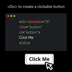
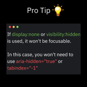
ARIA rule # 4: Don’t use role = “presentation” or aria-hidden = “true” on a focusable element.
Let’s understand the attributes first.
role=”presentation ” or role =”none” removes the ARIA semantics from the accessibility tree.
When is it used?
When an element is used for presentation only and does not have accessibility purposes.
aria-hidden is also used to hide non-interactive content from a screen reader.
When is it used?
When you want to hide elements like:
Decorative items like icons or images that have no meaning/context
Collapsed items such as menus
Duplicate content
When are the attributes used?
aria-hidden =”true” will remove the entire element from the accessibility tree.
role=”presentation ” and role=”none” will remove the meaning of the element but still expose its content to a screen reader.
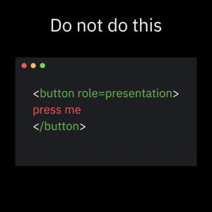
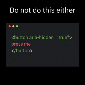
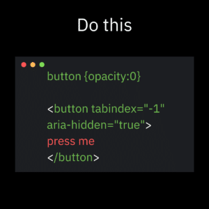
ARIA Rule # 5: All interactive elements must have an accessible name.
Accessible names help assistive technology users understand how to interact with an element.
Let’s look at what interactive elements are.
Interactive elements are:
- Links
- Buttons
- Text fields
- Checkboxes
- Combo boxes
- Radio buttons
An accessible name can be generated from a native HTML element’s content:
<button> uses the content between the opening and closing tags as its accessible name </button>
The <label> in a form will pull the content associated with its input as its accessible name.
If none of these options are available, use aria-label to define the accessible name of the element:
aria-label – text that labels the element is not visible.
aria-labelledby – visible text that labels the element.
aria-describedby – additional instructions for the input to users.
Conclusion
Now we understand what ARIA is and how it is used. We’ve also seen the benefits of using native HTML to make applications accessible out-of-the-box.
My key takeaway to prevent “excessive” ARIA use is by remembering one thing:
You don’t always need to provide instructions to screen readers only.
If the instructions are important enough, provide them to every user.
That’s what makes the best user experience.

