Online shopping is becoming more and more popular each day. Did you know that 76% of Americans are online shoppers?
However, the process of buying any product is different for each online shopper. To be more specific, there will be a significant percentage of buyers with disabilities, navigating through your online store can be a challenge for them.
With an accessible eCommerce store design, you can easily resolve these differences and offer a unique user experience to everyone. This article will explain why your eCommerce store requires an accessible design.
So, let’s dive in!
Table of Contents
What does Accessibility mean for an eCommerce website?
Accessibility for eCommerce websites is all about creating an inclusive experience by ensuring that all customers have barrier-free access to your online store. This means, not limiting the eCommerce user experience for people with physical, cognitive, and situational disabilities.
If you are planning to build an accessible eCommerce website, include these three-pointers within your checklist ASAP:
- Perceivable Content – your eCommerce store’s content should be easily perceivable for people with disabilities. For example, people with visual impairment use a screen reader to perceive the content of your store. A screen reader cannot perceive non-text content, but non-text content matters a lot for eCommerce stores. So what you can do is add alt text wherever non-text content is present.
- Understandable – your online store design and content should be easily understandable. A simple user interface that is interactive as well as understandable for people with disabilities is what eCommerce stores should aim for.
- Easily operable – If your online store is easily operable, it would mean that everyone can function with it, with or without any disability. For example, your website design should be flexible enough to support navigation through the keyboard. Furthermore, if there are any CTAs, you must add a link description text that clearly explains the purpose of the CTA.
- Robust – The content within your eCommerce website should be easily interpreted by users with disabilities. It should be robust enough so that assistive technologies like screen readers can interpret it without any challenges.
Why should your eCommerce store be accessible? – Different types of Shoppers and Solutions to Help them
The primary reason behind building an accessible eCommerce website is to provide widespread access for all online shoppers. There are different types of online shoppers, struggling with a wide range of disabilities. You can only call your eCommerce store interactive only if it creates an inclusive user experience for everyone.
Here are the different types of online shoppers that you can come across and the solutions to make your online store a better place for them:
1. Shoppers with visual impairments
Who highlights that 1 billion people globally have severe blindness. This explains why eCommerce stores should invest in an accessible website design to assist shoppers with partial or complete impairment.
Here are some solutions:
- Create a site design that is compatible with screen readers and the latest version of any browser
- Your eCommerce store should have a simple UI. Try to limit flashy elements and loud designs.
- Use high-contrast color schemes to easily differentiate between foregrounds and backgrounds so people with low vision can easily navigate the website.
2. Shoppers with colorblindness
Color blindness is another major disability across the globe. 1 in 12 men and 1 in 200 women are colorblind worldwide. With a few simple changes, you can easily address this concern and build an effective online shopping experience for users.
Here are some simple solutions:
- The biggest concern for people with colorblindness is that they cannot differentiate between a few color combinations. Some color combinations that are affected by colorblindness are –
- Red-Green – the most common
- Blue-Yellow – less common
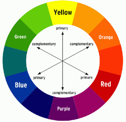
To address this, designers can refer to the color wheels and use the colors residing in the opposite ends of the wheel. These will be complementary colors and can create better UX.

- Another best practice for adding different elements to a web page involves the use of different patterns or textures to help users distinguish between various segments. It is also a good idea to add text labels to help them comprehend the website content easily.
3. Shoppers with hearing disabilities
Considering people with hearing disabilities should also be on your agenda when working on accessible design for your eCommerce store. People born with hearing disabilities face different kinds of challenges, which can reflect in their shopping experience. These include difficulty in listening to audio-only content, or accessing videos.
Here are some solutions to assist these shoppers:
- Start creating sign-language videos for different areas of your website. This is an expensive and time-consuming approach, but if you have the budget it will broaden your store’s outreach and ensure that more people can access your store.
- Some commonly used approaches involve the use of captions, subtitles, and transcripts to your audio and video content. These alternate forms of communication will provide information captured from the audio and video that could be otherwise not consumed by this group of people.
4. Shoppers with Cognitive Disabilities
There are many shoppers with cognitive disabilities and they face challenges when it comes to communication, understanding new tasks and performing them independently, and suffer from reduced memory and attention. Globally, 7% of online shoppers are aged above 65 and they face age-related challenges like terminal memory loss. Users with cognitive differences like Attention Deficit Hyperactivity Disorder (ADHD) also get distracted by too many pop-up ads on the websites.
Here are some ways to assist these shoppers:
- The web page layout of your eCommerce store should not be overly complex. Try to design a familiar and simple user interface without distractions like ads and pop-ups.
- eCommerce stores can also set frequent notifications and reminders to help elderly shoppers keep track of their online activities.
- Avoid distributing a single task over multiple tabs. This will help people with cognitive disabilities to remain focused on the task you want them to complete on a web page.
Final Words
We hope that the significance of accessibility for your eCommerce store is now clear. But the question is how would you know that your website is accessible and what are the areas you need to work on?
The answer to this question is – LERA.
LERA is a free accessibility reporting Chrome extension that can scan your eCommerce store for accessibility violations and suggest fixes for those issues. On LERA’s advanced dashboard, you can track all these accessibility violations and download the reports for free.


