An accessible website intends to create an equal flow of information for all the intended users. Web accessibility ensures that a user’s capabilities or the fact that they are specially-abled should not be a roadblock to accessing information.
However, incorporating web accessibility comes with its share of challenges. A survey by WebIM shows that common accessibility issues and errors are prevalent in the top 1,000,000 websites. In fact, many popular websites also fall under this category.
So what are the most common accessibility issues, and how do you fix them? That is exactly what we are going to cover in this blog. So, let’s dive in!
Table of Contents
5 Accessibility Issues [+ Solutions] Every Developer Must Know
Without further ado, let us get started with the most common accessibility issues and the possible solutions to those issues:
Issue 1: Poor Contrast Text
A common UI development hack is that the level of brightness of your text should not match the background color of your website. That’s because the poor contrast of the website makes it difficult for the users to identify the shapes and edges of various elements. As the overall number of mobile users is growing fast, fixing this accessibility issue has become even more significant.
Understanding a low contrast text is next to impossible for people with visual impairment or low vision. So, it is a must that websites find a way to fix this accessibility issue.
The Solution
Poor contrast texts are so common it is challenging to locate these texts. Whether you are reviewing your codes or trying to figure out how a text looks on screen, it is impossible to find it out from a visually impaired person’s perspective.
So, what is the solution then?
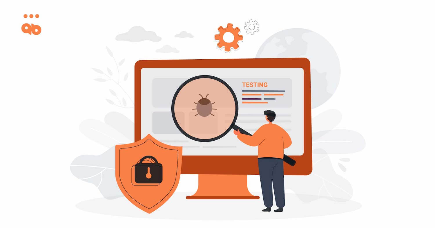
You can use a tool called LERA. It is an advanced web accessibility testing Chrome extension. You can run it all over your website and generate a granular report that identifies all instances of poor contrast in your website and detects the places where background and texts are not in the appropriate contrast ratio.
This report also helps you find out the potential accessibility fixes to these errors. When you figure out these areas, you must adjust the colors used in backgrounds and texts to improve contrast.
According to WCAG guidelines, the text to background contrast ratio should be 4.5:1. Once you comply with this criterion, the information on your website will be readable and accessible to everyone.
Issue 2: Leaving empty links and buttons
Developers often leave links and button texts empty. However, this is a critical accessibility issue that can cost your website big time! Links and buttons are often displayed as symbols on the web. So, when a user uses mobile to visit a website and there is limited space to accommodate information, there shouldn’t be empty links and buttons.
For example, if you see the symbol “+” over a button, you can easily understand that it indicates adding new texts to the page. However, the situation is different for a person with visual impairment.
People with visual challenges are heavily dependent on a screen reader to translate the purpose of these empty buttons and links. A screen reader cannot translate symbols and empty texts to these users. All it can communicate is a button with a “+” symbol on it. The purpose of this symbol won’t be clear to the screen reader, and therefore, the user will be in the dark.
The Solution
The best solution to this common accessibility issue is to add descriptions. For example, when you add a button with “+” symbol, you should also add a description that says “add new text”. The screen reader can quickly interpret this text and communicate its meaning.
Also read: Website Accessibility Checklist
Issue 3: Missing alt texts for images
According to WebAIM, 31.3% of home page banners were missing alt texts. From an accessibility point of view, this is a major challenge. Each image on your website should include an alternative text so that people with visual impairment can read it to understand what the image is all about.
When a visually challenged person uses a screen reader to access information on the website, the alt text will help it read aloud what the image is all about. It is the only way the purpose of an image can be translated to the users. Websites must add a brief, alternative text to each image to clarify the users.
The Solution
Developers can add the alt texts in any of the three ways mentioned below:
- Adding an “alt” attribute in case the image is shown under “img” tag
- For a background image with a different tag, you can use the “aria-label” attribute
- Using the “aria-labelby” attribute also works in case you are describing the image as the content of a different element
Remember to keep the alt texts short, descriptive, and to the point. It should only describe the image’s purpose. Note that you can always skip the alt text when using an image for purely decoration purposes. Alt texts are absolutely necessary for images that are meaningful to the content.
Issue 4: Missing document language
Sometimes, developers miss out on adding a proper “lang” attribute to the HTML document element. That’s again one of the most common accessibility issues that require immediate attention.
That’s because people with disabilities use the default language while configuring their screen readers. So, without the presence of the “lang” attribute, a screen reader will translate the website’s information in the default language.
This can increase the chances of using the wrong language library. In that case, the user will have difficulty understanding the website information, as there will be difficult words and poor pronunciations.
The Solution
There is an easy accessibility fix to this problem. Just use the “lang” attribute to set a primary language for your website. That way, it will be easier for the users to interpret the underlying information of your website with a screen recorder.
Issue 5: Non descriptive link text
People with disabilities, using a screen recorder, often jump from one link to another. They don’t use the texts in between. This is useful when a user is trying to reach a particular section within the website. However, if you add link texts to help the users, make sure that you use only relevant ones. Many websites display pointless link texts that misguide the users.
For example, if all your CTAs say “Click Now” or “Read More“, it will only confuse people. Such ambiguities confuse your website, users and stop them from accessing the information in the right way.
The Solution
Make sure that your link texts don’t originate any confusion. Instead of stating “Click Here“, it should rather say “Click here to find out more on accessibility“. The purpose of these link texts is to help the users find out what all to expect from the destination pages. So, the more specific it is, the better.
Final Words
When you are building a website from scratch, there are multiple things to keep in mind. It becomes a challenge to keep all these accessibility aspects in mind. In fact, new developers can often get overwhelmed with so many accessibility guidelines.
The best way to cope with this challenge is getting an accessibility testing extension like LERA. Here is how it can help:
- Quick scan and audit of your website
- Automated accessibility report generation
- Easy to install Google Chrome Extension
- Free web accessibility testing at your fingertips
Want to know more? Get Lera now.