
Using single sign on or password managers for sites that don’t allow SSO is a common practice to make account sign up or logins faster. You don’t have to use a screen reader when filling out forms to know how difficult it can get when it comes to the password fields. As someone with cognitive impairments, I often struggle with remembering all the requirements to fulfill a password strength meter. What’s worse – the placeholders disappear as soon as you begin typing.
The non-inclusivity of password requirements is what fueled this article today.
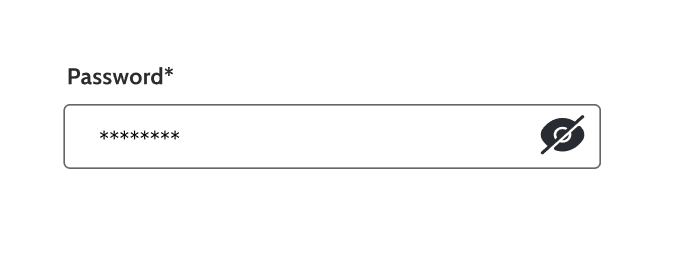
We do witness more single password inputs in today’s design trends, however there needs to be a mechanism to confirm the intended password is typed correctly. Show/Hide buttons address this gap, usually designed as an eye icon, but sometimes the words “Show” and “Hide” are also used. The show button is not only a blessing for users like myself but also benefits users with mobility impairments, seniors, and users of assistive technology.
Table of Contents
During my auditing work, I’ve come across the use of Disclosure widgets and Toggle Switches. I don’t believe either method is wrong but comes down to a matter of preference for users of assistive technology.
A Disclosure button will cause AT to announce “button show password expanded/collapsed”. If coded as a Switch the nature of the announcement will change to “button show password on/off.”
Note: Older implementations of switches may have been announced as checkboxes. First reported in 2020, there was an NVDA issue that caused it to announce a switch as a checkbox. This was due to lack of support to differentiate the aria-checked attribute between role=”checkbox” and role=”switch”. This is now fixed.
Simple Password Toggle Design Pattern
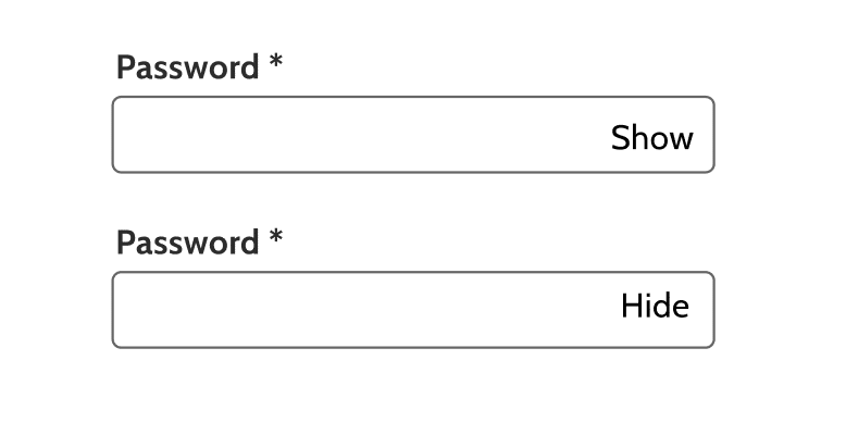
The toggle button can be as simple as using the text “Show” and “Hide”. We see a lot of <div> elements being used for switches. While it is not wrong, and at the expense of sounding like a broken record I insist on using the native HTML <button> element. It will automatically receive focus and remain in the DOM tab order, avoiding the need of a tabindex=”0” global attribute keeping your code clean.
The aria-checked attribute is required when using role=”switch” and the values are “True” or “False”. These values need to be updated via Javascript when turned On or Off.
The Space and Enter key should activate the switch. If using a native <button> element this will be taken care of via HTML automatically.
Code:
<button id=”show-password” type=”button” role=”switch” aria-checked=”false”>

<span> Show Password</span><span>Hide Password</span>
Password Instructions Design Pattern
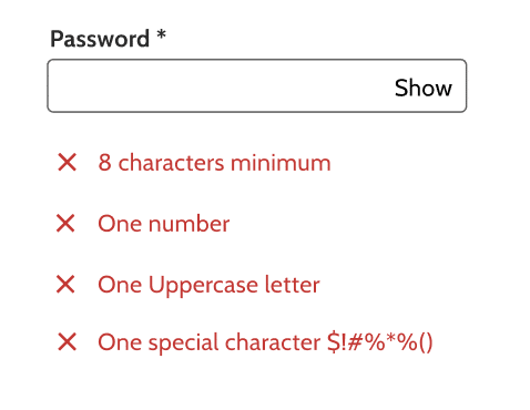
We can start to get fancy by adding password instructions required to create an account. Undoubtedly, this pattern is more user friendly and helps all users meet the requirements.
How do we make this accessible for assistive technology?
- list our password requirements somewhere on around the form field for all users to access
- Assign an id to the text e.g. “instructions”
- Use aria-describedby = “instructions” on the input. This will allow AT to announce them when the users reach the password input field.
- Write password messages e.g. “Show Password” “Hide Password” and set an id
- Apply a live region aria-live=”polite” to the password message id. When the text updates the state changes and the user is informed. The Polite attribute ensures that the user is not interrupted while typing.
- If icons are informative, use aria-label as their accessible names, and aria-describedby to connect them to the “instructions”. The icons could also be marked decorative as there is enough information conveyed via aria-describedby
Password Instructions with Icon Design Pattern
Using the eye icon is popular with today’s design trends, and it follows the same coding pattern as using Show/Hide text with the exception of using alt text for the icon. The visible instructions can be placed inline to make use of the real estate on the page.
Optionally, the instructions can be completely hidden for visual users through the visually-hidden or sr-only CSS classes. But that won’t make it inclusive would it? If the instructions are important enough for one group of users, everyone should be able to access them.
Code:
<form>

<p id="instructions">Password: Must be at least 8 characters. Must have at least 1 number. Must have at least 1 uppercase letter. Must have at least 1 special character.</p>

<p aria-live="polite" id="password-message" >Hide password.</p>

<div class="input-with-button">

<button id="show-password" type="button" role="switch" aria-checked="false">

<img class=" show-icon" src="icon.png" alt="Show password">

</button>

<label for="password">Password</label>

<input aria-required="true" type="password" aria-describedby="instructions" >

</div>

</form>
We hope that helps you build inclusive components accessible for all your users. If you need help with accessibility design reviews, our engineers review the code on your existing components and perform accessibility design reviews in Figma with annotations on new component designs. Reach out to us at info@advancedbytez.com. Happy coding!