

An accessible website helps users with disabilities to navigate, interact and comprehend information seamlessly. According to WHO, 2 billion people live with disabilities worldwide. This clearly states that accessibility is no longer an option but a mandatory aspect to ensure equal access to information.
We all know that developers are responsible for designing websites. Do they know everything about accessibility? This is a critical question; every brand should find the answer to.
Here is a guideline to help you create a quick accessibility checklist for the new developers. So, let’s dive in.
Table of Contents
- 1 10 Accessibility pointers every designer must know about
- 1.1 1. Use optimal color contrast between texts and backgrounds
- 1.2 2. Use descriptive link texts
- 1.3 3. Balance between content and visual hierarchy
- 1.4 4. Color is not the only way to highlight essential information
- 1.5 5. Accessibility audit is an option
- 1.6 6. Avoid using UI animations and flashlights
- 1.7 7. The Navigation option should be clear
- 1.8 8. Add visual focus indication for keyboard users
- 1.9 9. Design accessible forms
- 1.10 10. Add alternatives to images and other media files
- 2 FAQs
10 Accessibility pointers every designer must know about
Follow these accessibility design guidelines to make your website design-ready:
1. Use optimal color contrast between texts and backgrounds
Color falls under the “must-do” accessibility design guidelines. When designing for accessibility, refer to the WCAG guideline which says that the minimum contrast ratio between a text and its background should be 4.5 to 1. The aspect ratio drops at 3 to 1, in case your font size is at least 19px bold.
Using proper colors for website development, ensuring contrast and highlighting information with appropriate shades are the biggest accessibility aspects. Remember, you are designing a website for the users who are color blind or are using prescription glasses. Your responsibility is to help them develop a frictionless experience when they are on your website.
Note that, logos, elements, menu items, non-functional buttons are not part of accessible UX design. On the contrary, placeholders and ghost texts are essential parts of the accessibility design standards like WCAG.
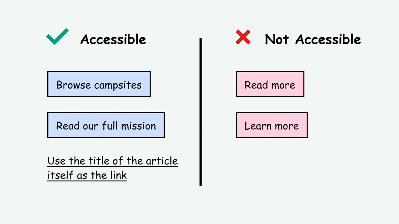
2. Use descriptive link texts
It is very common for websites to add multiple internal and external links to their web pages. This action aims to redirect the users to those respective landing pages for various reasons like lead form filling, subscribing, downloading a resource, and so on.
While this is a good strategy, developers should also be super careful about the users with disabilities. Adding only internal/external links to the destination pages is not enough. These users would require some context behind adding these links.
Hence, whenever you add any links to a web page, make sure that there is a descriptive link text. This will help the users understand the purpose of transitioning to the destination page.
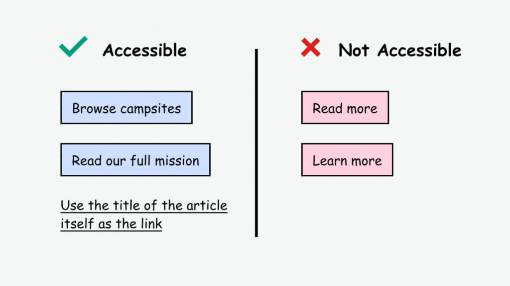
For instance, suppose you want the users to book a free demo. So, instead of simply writing “Click here”, you should write “Click here to book a free demo”.
3. Balance between content and visual hierarchy
Developers should make it a point to establish a visual hierarchy in the website with all the major UI elements. This hierarchy is all about arranging the visual elements in the right order to build a coherent picture.
Here are some pointers to keep in mind for ensuring appropriate visual hierarchy and effective UX accessibility:
- Content on any webpage should be scalable. That way, when a visually impaired person magnifies their screen, the visual hierarchy is not lost.
- The web pages should have enough space. Don’t overdump information to intimidate users with disabilities.
- All sections should have suitable headings so that users can perceive what is underneath these sections.
- Use clear and concise CTAs for the understanding of the users with disabilities
4. Color is not the only way to highlight essential information
I agree that color is convenient to highlight essential information on your website. But is it the only way? Not really!
When it comes to accessible UX design, every developer should realize this. Add an identifier other than colour when differentiating useful information from other general information on the website.
Here are some easy ways to do that:
- Add an explanatory text/sentence on why a particular piece of information is important
- Use distinctive labels alongside the critical information
- To highlight required fields in a form, you can use an asterisk alongside color
5. Accessibility audit is an option
A great way to introduce accessibility in UX design is through a quick accessibility audit. Sometimes, developers can try to make a website accessible, but some gaps remain. That is why it is best to use an accessibility testing tool to identify these gaps and fix them accordingly.
Businesses can perform automated and manual accessibility tests using accessibility testing tools or extensions. Experts conduct such accessibility tests to highlight the limitations and missed accessibility points in your current website design.
6. Avoid using UI animations and flashlights
It is very common for websites to use animations, GIFs, flashlights etc. to make the web pages more engaging. While this is a cool way to hook readers, it is not a part of UX accessibility.
Did you know that a loud media flashlight can instantly trigger seizures for people with photosensitive epilepsy? Since the world of the web is for everyone, I strongly recommend that developers avoid flashing colors unnecessarily. Being negligent to this can also invite lawsuits for businesses.
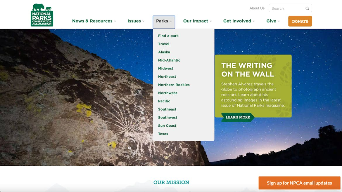
One of the greatest examples of accessible design is a website with a clear navigation option. In fact, a simple navigation bar allows you to enable the self-serve mode for the users. It is therefore essential for all users, irrespective of the disability factor.

Here are some things to keep in mind when designing a navigation bar for the website:
- There should be a navigation bar on every website that lists different website sections in one place.
- Users should have easy access to the site map option.
- Developers should also consider using breadcrumbs to help the users understand exactly where they are within the website.
8. Add visual focus indication for keyboard users
Some users are highly dependent on keyboards and they use the “Tab” key to jump between links, website forms and any other content within the website. However, it is next to impossible for keyboard users to identify where they are on your website due to visual imparity.
To resolve this challenge, designers must include a clear indication on each web page to help the keyboard users navigate through the website. Developers can use this focus indicator to help the users move back and forth between links, CTAs, forms, widgets and so on.
Here are some pointers to keep in mind when designing a focus indicator:
- Maintain good contrast.
- The shape and size of the indicator should be complementary and the color should be attention-grabbing.
- You can even animate it to help the users track their movements.
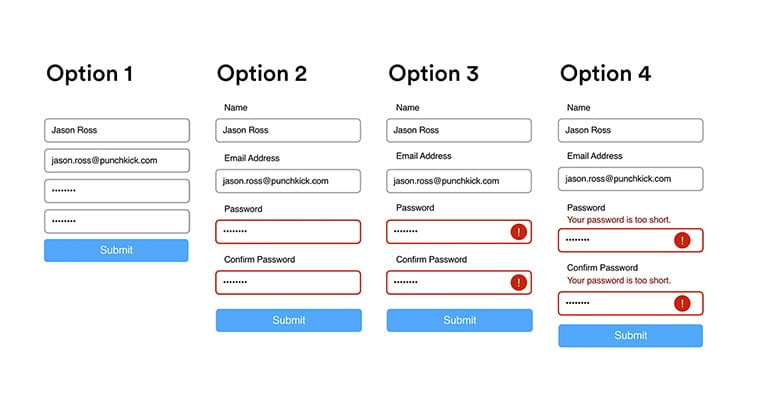
9. Design accessible forms
Suppose you are trying to fill up an opt-in form on a website. However, the form is filled with inconsistent content, incomplete format, and lack of keyword accessibility. Won’t that be annoying?
Now, imagine that a visually impaired person is trying to fill the same form. How frustrating will their experience be?
Developers who are concerned about UX accessibility must focus on designing accessible forms to enhance users’ experience. Here are some factors to keep in mind:
- Use placeholder text in each field of the form. This gives the users an idea of what information to insert in that particular field.
- Don’t forget to add clear labels to each input field. This helps the users to distinguish between mandatory and optional fields.
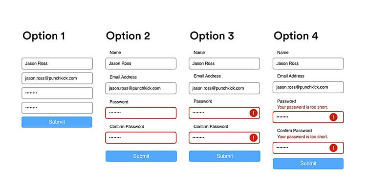
- Don’t forget to include error messages. When a user is filling a certain field and there is an error, they should be able to figure it out before the submission.
- Make the forms accessible for keyboard users. Use UX accessibility design to ensure that keyboard users can jump between one input field to another using “Tab” key.
10. Add alternatives to images and other media files
Each media used in your website should have an alternative text. This includes images, videos, GIFs, audio files or any other media type that you can possibly think of. This helps people with disabilities to comprehend the purpose behind adding that media to that particular content. However, if you are using an image purely for decorative purposes, you may skip it.
Final Words
Developers should keep in mind that web accessibility is certainly not a roadblock in the path of innovation. Developing an accessible website design is simply related to taking a step toward equal information access.
The UX accessibility elements don’t make your website a boring one! In fact, it encourages you to build a website that everyone can explore.
