

Accessible products don’t just happen. They start well before development, at the planning and design stages. It’s essential to start thinking about accessibility early and ensure you’re testing for it at all stages of the design and development lifecycle, including wireframes.
In this post, we’re focusing on steps to ensure that wireframe designs for new websites or apps are created with accessibility in mind. Make sure your team is trained to review wireframes thoroughly and that developers understand
Table of Contents
How to translate clear wireframe designs into accessible HTML CSS content.
Cost-effective design
A good incentive when reminding designers to incorporate and check for accessible features is understanding the cost benefits. “Shifting left” to review and address accessibility issues early reduces the number of changes and fixes required down the road.
Annotations and explanations
Include annotations to explain the intent of design details. These can be provided as textual notes or as graphical flow charts or images. Be sure to explain the design intent so developers can decide how to create features in a way that is accessible for all users. For example, use annotations to describe the preferred appearance of the hover and focus states for buttons, so keyboard users will have a visual indication of the currently focused control.
Clear labels
When creating label names in the wireframe, think about the purpose and function of controls and links for the user, not the developer. Ensure that label names are logical and intuitive. Make sure they’re also unique on each form, for both usability and easier searches.
Labels should use plain language, avoid uncommon slang, acronyms, or terminology, and be simple and easy to understand for all users. For example, if an assistive technology user hears a screen reader describe a label or control as “previous” or “current,” this is not as helpful as clarifying “Previous Employer” or “Current Employer.” Similarly, links should describe briefly what the link will lead to or open, rather than just indicating, “Click here.”
Heading structure
Assistive devices like screen readers use tagged headings and subheadings to navigate web pages and sections of digital content. This helps individuals with low vision or those using assistive devices to search or scan content, by choosing to hear all the headings on the page.
Nested heading structure is an essential feature for content accessibility and organization. The wireframe designer should include a clear list and description of all headings and subheadings. Without documentation, a developer likely will not be able to determine the structure. Take time to double-check that the heading structure is consistent and logical, with subheadings nested in the appropriate order.
Focus order
Focus order – clarifying the order that elements on a page receive keyboard focus – is essential information for keyboard accessibility. Wireframes should indicate the focus order information clearly and specify the visible focus state.
Users of screen readers benefit from wayfinding cues that can help them navigate a webpage. For example, including instructions for when to include “Bypass block links” allows screen reader users to skip over repetitive and unnecessary blocks of content rather than tabbing through unnecessary information. Refer to WCAG 2.4.1 for more information.
Describe these repetitive blocks in the wireframe so that developers can include these wayfinding cues. This helps ensure that users can tab once into a content area, but then skip to the next content area if they choose.
Testing wireframes
It’s challenging to do usability testing on a non-existing system, particularly with people with different types of disabilities (for example, dexterity, visual, hearing, cognitive). If it’s early in the design stage, try to find a similar tool or task on a functioning system and test its accessibility with users with disabilities.
If issues arise that are identified as “accessibility” bugs, ensure that these are prioritized and included with the rest of the workload and not as lower priorities that can be addressed after “core” features.
Taking the time to design clear wireframes and consider the accessibility for all design elements helps ensure that the wireframe is complete and usable for developers. Ideally, tested and approved wireframe designs can then be used as templates to help create accessible products with similar branding.
How AdvancedBytez can help
Beginning design review and testing as early as possible can solve or prevent up to 67% of potential bugs. This number is frequently referenced in the accessibility industry, and refers to a Deque case study.
The typical steps to review wireframe designs include (1) a site map design review, (2) a review of the layout with no color, followed by (3) a review of the layout with color.
1. Site map design review
Following a Shift-Left approach, AdvancedBytez encourages our clients to begin their accessibility design review at the site map stage.
Technically, the site map is a hierarchical listing of a website’s pages. Practically, it should act as an ongoing guide for developers for each project, providing details about each page’s purpose, content, functionality, and flow.
AdvancedBytez can review your sitemap design and help ensure that it includes all items needed for clear and accessible utility navigation, main page and secondary pages, and footer navigation. We can provide recommendations for clear guidelines, logical page content, and suggestions for combining or eliminating pages.
A sitemap design review will help ensure a clear, concise, and accessible flow to help your developers create a user-friendly, accessible website.
2. Review of wireframe layout with no color
Also referred to as a low-fidelity wireframe review, AdvancedBytez tests low-fidelity wireframes (the foundation of visual designs but without colors or images) by focusing on accessible placement of assets and content for each template.
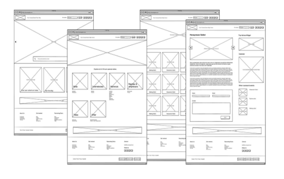
Working with designers and design teams, elements such as buttons and interface widgets are tested with a screen reader.
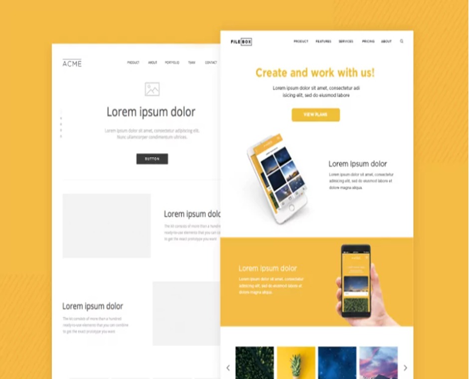
3. Review of wireframe layout with color
High-fidelity wireframe testing involves reviewing a more complete representation of the end product.
After any design changes are made based on earlier site maps and low-fidelity review feedback, we then test color contrast, font usage, and complex interactions. In this third stage, we review usability and provide results of user interaction testing with the graphics, spacing, and user interface (UI).
Sitemaps and wireframes take time to create because they’re essential tools in helping developers create usable and accessible websites and apps.
Make sure your team is trained to review wireframes thoroughly and create clear and complete guidelines for your developers. Consider having AdvancedBytez test these tools–we can help ensure developers have everything they need to translate design wireframes into accessible HTML CSS and user-friendly content.

One response to “How to Translate Design Wireframes into Accessible HTML and CSS?”
Thank You For Sharing Informative Content