

Alt text stands for “Alternative text”. Simply put, alt text is a brief description of an image that explains the images quickly. So, even if you can’t view an image, you will have a clear idea of what the image is all about, through alt text.
People with visual impairments may not be able to see the content of a website. They use a screen reader to access the information of a website. Hence, adding alt text to all images is a must to ensure a seamless experience for these users.
Below are some easy tips to write good alt text for accessibility. So, let’s dive in!
Table of Contents
- 1 10 Tips to Write Good Alt Text for Best Accessibility Practices
- 1.1 1. Being specific is the key
- 1.2 2. Stay informative
- 1.3 3. Don’t use phrases like “Image of..”
- 1.4 4. Don’t be repetitive
- 1.5 5. Decorative images don’t require alt text
- 1.6 6. Photo credits and alt texts are not the same
- 1.7 7. Don’t forget about punctuation
- 1.8 8. Include the function of the image
- 1.9 9. Add keywords as per requirement
- 1.10 10. For complex images, add a note too
- 2 3 Alt-text examples – The Good and Bad!
- 3 Final Words
10 Tips to Write Good Alt Text for Best Accessibility Practices
Here are some quick tips and accessibility best practices to write alt text:
1. Being specific is the key
When you are writing an alt text, you are simply describing the image. Remember to stay as specific as possible. Alt text is not a place for you to show your writing skill. An alt text aims to explain the purpose of an image to people with visual disabilities.
So, the more brief and specific the alt text is, the better. A few words are enough to describe an image most of the time. In fact, people with visual impairment and cognitive disabilities use a screen reader that trims down around 125 characters of an alt text. So, it is better to stick to maintaining the brief character limit.
However, it is necessary to use long alt texts to describe complex images. But then again, those are exceptional cases.
2. Stay informative
The goal of an alt text is to convey the information within a picture. So, the first rule of thumb is that your alt texts have to be as informative as possible. Let me break this down with an example:
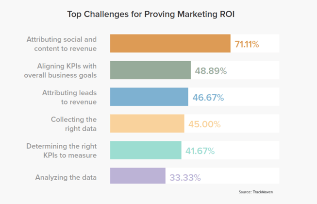
What should ideally be the alt text for this image?
Different challenges of providing marketing ROI
That’s a brief and specific alt text. So, when a person with a disability comes across it, there will be no confusion about understanding the image and what it is all about.
3. Don’t use phrases like “Image of..”
We often come across alt texts that start like this – “Image of..”. This is actually frustrating for people using screen readers, since the software already announces that it is an image.
Also, when you are using such phrases, you run the risk of exceeding the number of characters. The screen reader already trims down 125 characters from the alt texts. So, with the remaining characters, you would want to fulfill the purpose of the alt text that is describing the image.
4. Don’t be repetitive
You don’t need an alt text if it is a repetitive version of what’s already in a web page. This will save developers’ time and let them focus more on other avenues of development. So, don’t spend time on writing something similar, that’s already there in the web page.
5. Decorative images don’t require alt text
All the images within a web page don’t add value to the users. Some images are purely there from an information perspective while others are there for decorative purposes. Decorative images might include brand logos, page dividers etc. These images provide a visual break-up to the content.
From a web accessibility perspective, there is no need to add alt text to these images. These images don’t have any contextual significance, and you can skip the alt text. Adding alt text to those images won’t help people with disabilities to understand the web page content better. Screen readers generally skip these decorative images, which are marked with empty quotation marks that look like – “”.
6. Photo credits and alt texts are not the same
Many times, developers get confused between photo credits and alt texts. Photo credit is about acknowledging the photographer for a picture they capture. Alternatively, alt text is a brief description of the image to help people with disabilities understand it better.
So, it is not required to add photo credits in the alt text. It only wastes valuable characters that you could use to describe the image properly. The best way to add photo credits is in the form of captions for images.
7. Don’t forget about punctuation
Alt texts should include normal punctuations. Use commas and full stops like you usually do in sentences. Don’t skip any punctuation as it would be difficult for the screen reader to interpret the alt texts to the end-users without punctuations.
8. Include the function of the image
When a writer is adding an image to particular content, there should be a purpose behind it. So, while writing an alt text, if that purpose is clear to you, adding the alt text won’t be a challenge at all.
Just ask these questions to yourself:
- Why am I including this image as part of this content?
- What is the core message that I am trying to convey through this message?
- What additional information should I add in this image description to ensure that the user doesn’t miss anything?
When you can consolidate all this information and put those in the form of a brief description, your alt text will be ready.
9. Add keywords as per requirement
Adding a few keywords within the alt text is always a good idea. This will help you rank faster in the search engines. But remember, don’t stuff keywords for the sake of ranking, or it can prove to be irrelevant to the user. If a particular keyword is not relevant to the image, don’t add it, no matter what!
Adding irrelevant keywords can turn your content into spam and it will hurt your search engines rankings. So, when writing an alt text, think from the perspective of someone with visual impairment. All they want is a quick description of the image. Not a bunch of keywords that don’t add any value.
10. For complex images, add a note too
Sometimes, you may come across images that are too complex and impossible to describe within 125 characters. There is more information to convey and accommodating it all within the alt text is not possible.
So, what do you do in those scenarios?
Add a special note below the images that explain the complex image in detail in the form of an explanatory note.
3 Alt-text examples – The Good and Bad!
We hope by now you have a fair idea of how to write alt text. Now, let’s show you some good and bad alt text examples:
Image 1: A tiger

Bad alt text – An angry tiger waiting for its next prey.
Good alt text – The close-up of a tiger.
Image 2: A plant

Bad alt text – Houseplant
Good alt text – This is clearly a decorative image. So, it doesn’t require an alt text. The alt text field can be filled with “”.
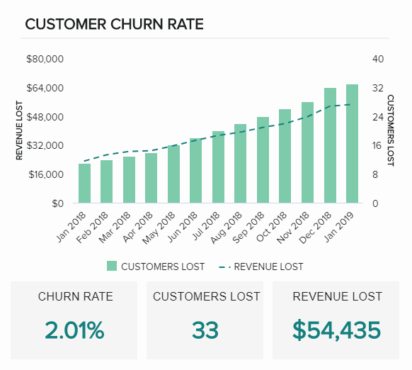
Image 3: Chart

Bad alt text – A chart that explains customer churn rate, customer lost and revenue lost from January 2018 to January 2019
The reason the above alt text is “bad” is because it is too long. It is one of those images that require an accompanying note or a caption.
The good alt text is as below:
Good alt text – Customer churn rate distribution chart
Final Words
Are you interested in learning more about web accessibility and the ways to improve it? Alt text is not the only factor that you should focus on in that case. There are many additional factors involved. All those can jointly make your website accessible.
It is difficult for business owners to identify the accessibility requirements of a website on their own. That’s exactly why they need a web accessibility testing tool like LERA. It is a free Chrome extension that auto-checks your website’s accessibility situation and offers fixes in the form of a granular report.
Want to know more? Get it for free and start exploring!
Even still, automated softwares cannot detect the relevance of an alt text. They will only detect the presence of alt. You will need a human checking the alt text to determine the relevancy. Writing alt text is an art to convey information within 125 characters. If you need help writing alt text, contact us at info@advancedbytez.com to get a quote.

2 responses to “What is Alt Text? How to write good alt text for accessibility?”
Informative
Thanks for the post. It is a nice article on Alt Text and it covers a lot of points. Looking forward to more posts.