Generally speaking you shouldn’t disable or hide interactive elements unless you really have to.
Disabling buttons is a common practice used across the web and there are mainly four reasons why it’s done:
- Gating and controlling access to unauthorized parts of a website.
- A process is currently loading after the user clicks a button.
- Input issues, either missing or not valid.
- Unavailability of an upcoming feature.
Each one of these cases conveys the same message: the button is currently unavailable.
It does exactly what it’s intended to do, but we’re faced with accessibility and usability issues if not done correctly. Understanding how your users interact and use interactive elements like buttons is important for web accessibility.
Table of Contents
Why Are Disabled Buttons Bad For Accessibility?
1. They Confuse Users
Why isn’t the button working? Is it my internet connection? Why does this button look weird?
These are questions a user with cognitive or learning disabilities might ask himself when looking at a disabled button. With disabled buttons, because the rest of the interface is accessible, users may be led to think that there is a problem with their input, especially on mobile. Most of the disabled buttons found on the web don’t give any feedback on why they’re disabled which adds to the confusion. Users are left to find out what went wrong using their gut feeling.
Buttons usually have a call to action on them such as “Order” or “Send”, and that’s often what a user wants to do so they will try to click them and if it’s disabled it won’t do anything.
Making users think about your UI is always bad for usability because it adds a layer of difficulty to the task. A general rule in web usability is that tasks should be completed with as little effort as possible.
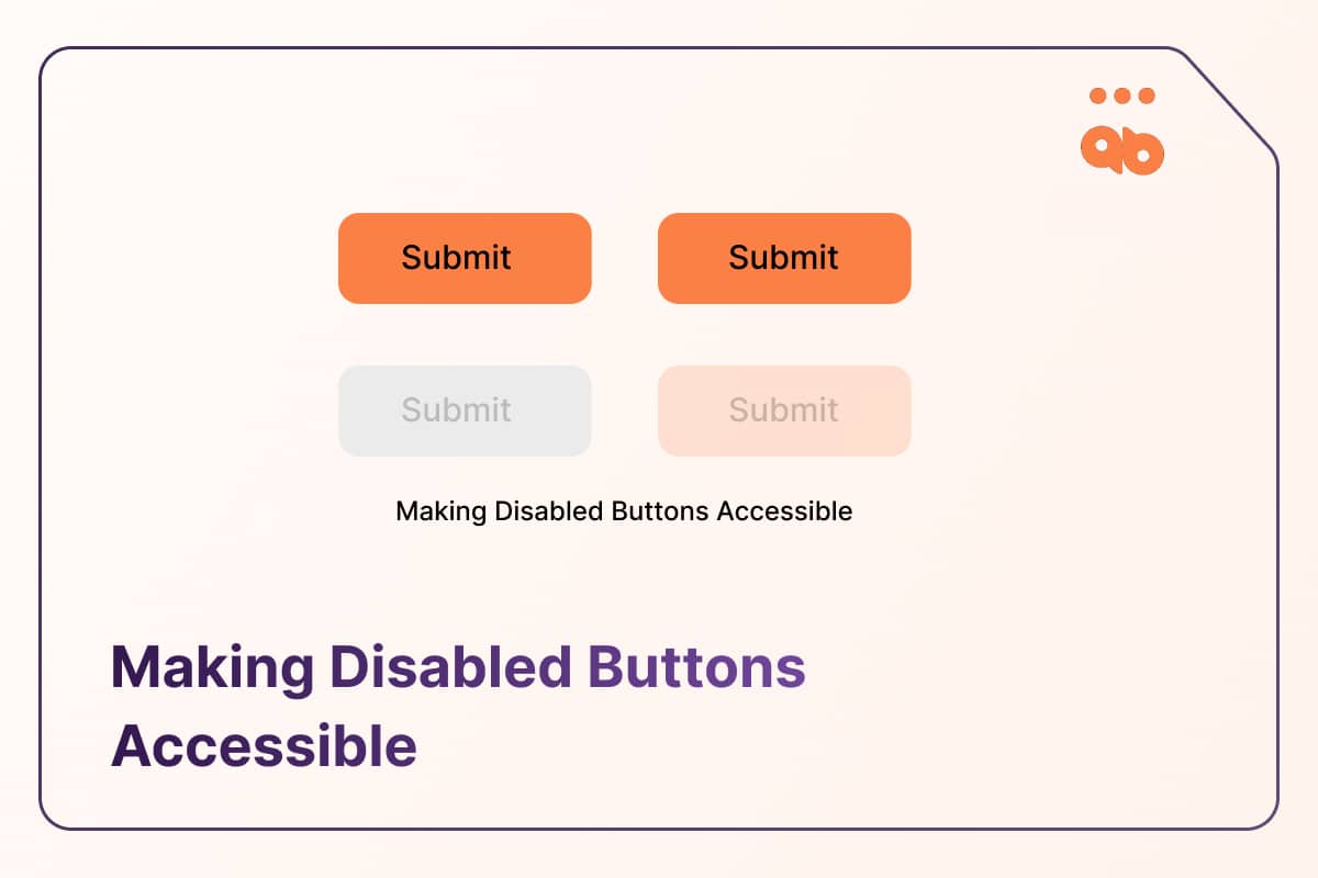
2. They’re hard to see
There are no contrast requirements for disabled elements in WCAG, which doesn’t mean they aren’t an accessibility issue and that you should ignore them. Disabled buttons are often grayed out or have muted colors, which in both cases are an issue for users with low vision and visual disabilities.
Even though this state is not subject to passing color contrast guidelines, the use of color (1.4.1) alone should not be the only means to convey information. Increase the contrast so that the style is substantially different from the non-disabled styles, even for color-blind users.
Text within a button should always be visible whether disabled or not to give context to the user. Use helpful button text that allows the user to identify that it is disabled and not a user error.
3. They’re invisible to assistive technology
Disabled buttons are usually invisible to assistive technologies such as screen readers and switches when pure CSS and Javascript techniques are used.
Users who rely on assistive technology won’t hear the state of the button indicating the presence of a disabled button that is conveyed visually. Read below to explore a few methods to make disabled button states accessible to assistive technology.
How To Make Disabled Buttons Accessible?
Now let’s have a look at how you can make disabled buttons more accessible to your users:
1. Use aria-disabled
Setting aria-disabled to “true” will allow the button to receive tab focus, but indicate to screen readers that the button is inactive, announcing its disabled state. If the button using aria-disabled, is left in the DOM order intentionally, the styling that is used needs to pass contrast minimum as we noted earlier.
Example code for using aria-disabled attribute and allowing the control to receive focus:
<button type=”submit” aria-disabled=”true”> Add to Cart</button>If you want to remove it from the tab order, a negative tabindex can be used and this will replicate the behavior of the control when the HTML disabled attribute is used.
<button type=”submit” aria-disabled=”true” tabindex=”-1”> Add to Cart</button>Another use case for using the aria disabled attribute is if a custom control is developed using <div> or <span>. These non-HTML elements do not support the disabled attribute even with a role=”button”, and the aria equivalent should be used to disable the control.
<div role="button" aria-disabled="true" tabindex="-1">Edit</div>Making sure that your focus order is consistent is important for UX and aria-disabled does exactly that by keeping interactive elements discoverable and disabled at the same time so you don’t have to remove them completely. This is important for submitting buttons in forms and items temporarily unavailable to a user. An example of this instance is when buttons are disabled due to a lack of validation or lack of. It’s not ideal UX, and if this design pattern must be used, provide an error message explaining what went wrong.
The <disabled> HTML attribute on the other hand disables the button completely by removing it from the tab order, however it will be announced as “unavailable” to assistive technology in browse mode.
<button type="button" disabled>Click Me!</button>Using aria-disabled will still allow a tab stop on the elements, it may be potentially confusing for keyboard-only users.
There are pros and cons to using both methods, and using either the HTML or ARIA equivalent of the disabled attribute must be chosen with care.
2. Use of visual indicators
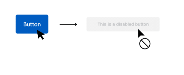
A good design practice we tested on user groups is the use of the CSS property cursor: not-allowed for visual users with cognitive impairments. Using this cursor property on a disabled button will provide an additional visual indicator that the button is inactive.
3. Show Help Text
Showing visible text around the disabled button is an easy and straightforward way to make them more accessible and gives context to the user on why a button is currently unavailable, similar to form instructions. An example of this while filling out a form can have an instruction above the submit button that reads, “all fields in this form must be filled out before being able to submit it”, or similar.
When using this method it is important to style the help text differently to make it perceivable and visually distinct from the button. By using different fonts, colors or by adding a border to the help text.
4. Don’t Mute Colors
DIsabled buttons often use bad contrast or muted colors that make them less visible to users like those with low vision.
One way to solve this is to avoid using default colors when it comes to disabled buttons. Your design system should have a provision to include a design for disabled buttons that is different from the primary and secondary buttons, such that they are distinct from the more frequently used colors and differentiate them at the same time. You can test if the color is WCAG-compliant and visible by using a contrast checker.
5. Don’t Disable Buttons
The easiest solution would be to avoid using the disabled state for buttons at all, but in case you have to use them make sure to follow accessibility guidelines as much as possible and the tips I’ve mentioned above to provide a better user experience.
Conclusion
Generally speaking, it is always better not to disable buttons if you can because this affects user experience in a negative way.
Especially with disabled users, but if you have to, there are ways you can do it in an accessible way as we’ve seen in this article.
Keep in mind that there’s no one size fits all solution when it comes to making disabled buttons accessible. Testing different solutions, techniques and using user feedback is always better for optimal results.