
Forms can be a major cause of concern for disabled users. Issues such as not being able to navigate input fields using the <TAB> key or form error messages not being perceivable or understandable are quite common on websites.
Making sure that error messages on forms are accessible is crucial for UX and ease of use. Failing to do so can result in a user being frustrated and leaving a website which is bad for business.
Making users aware and offering appropriate information to correct an input error are part of the WCAG 3.3.1 and WCAG 3.3.3 Success Criterion respectively.
We will be looking into a client-side solution in JavaScript at the end to validate a form, bring focus to a field containing an error and read it out loud to a screen reader.
But first let’s have a look at what an accessible form error consists of.
Table of Contents
What is An Accessible Form Error Message?
Making form error messages accessible is important for UX. This enables users to interact with a form effectively, helping them understand input errors and solve them whenever they happen. This is useful especially for those with visual disabilities.
Here are the key features an accessible form error should have:
Clear And Descriptive
The input error message should be explicit, in plain language and explain precisely what went wrong and instruct the user how to correct the issue.
Usage of technical jargon or ambiguous terms should be avoided to not confuse users. This helps in making UX seamless and easy to understand for everyone.
Visible With Consistent Formatting
It should be visible to the user, associated with the form field that has an issue and use consistent formatting across the website. This helps in keeping the interface clean and comprehensible.
Aria Attributes
It should use the Aria attributes aria-live to alert assistive technology when an error occurs and aria-describedby to offer helpful form hints to screen reader users.
Focus Management
The browser should bring focus to the first form field that has an issue after the form was submitted. This helps users using assistive technology navigate to the field and correct it.
Color Contrast
It should have enough color contrast between the error message and its background. Enabling users with visual disabilities such as color blindness to differentiate the error messages from the rest of the website content.
Form Error Identification, Correction And Accessibility
After a user submits a form that contains an error, the error message provided must be presented in a certain way to be considered accessible:
- Identify fields that contain errors: Making the user aware that there’s an issue with a form being submitted is the first step in solving it and this starts by highlighting the fields that are of concern. This is helpful to users who have a visual disability by making it easier to locate fields that contain an error.
- Provide suggestions to correct the errors: Some users need more assistance in solving form errors so giving tips on how to solve them can be quite helpful. This can also be a time saver for users with or without disabilities.
- Expose the information properly to assistive technology: This will help screen reader users understand what went wrong, one way this can be done is by setting aria-invalid=”true” whenever a field is invalid which will make screen readers identify the field as invalid and in need of attention. Using appropriate ARIA labels is an easy way to make forms more accessible to assistive technology.
There are multiple ways we can present an error message to a user, we’ll keep it simple and focus only on inline error messages since they’re commonly used across the web.
What is an Inline Error Message?
An inline error message is one that appears close to the field containing an error, usually on top or the side of the input field. The error message should generally let the user know what went wrong and how to resolve it.
The key advantage of this type of error message is that they appear close to the field within context, dragging the user’s attention where the error is located.
Not all users have the same level of understanding of the English language, users with cognitive and learning disabilities often have a reduced vocabulary making it harder to learn and understand new terms. Which is why using clear wording in plain language is a crucial aspect of an accessible inline error message. This allows the error message to be understood by a broader audience.
Like with any type of error message, making inline error messages easily distinguishable from the rest of the form by having enough color contrast between the message and the background is important when implementing this method. This saves the user time when searching for the error within the form.
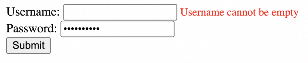
Here’s an example of a simple Username and Password form with an accessible error message which alerts the user that the “Username cannot be empty”:
On the other hand if the form contains multiple input errors, having the user scroll or <TAB> through dozens of fields can be frustrating especially for disabled users. In which case focus management comes into play, you can read more about it here.
Generate An Accessible Inline Form Error Message Using JavaScript
Let’s have a look and break down an example where screen readers read an error message whenever a field is empty.
Username And Password Form
Here’s the HTML of our Username and Password form:
<!DOCTYPE html>
<html lang="en">
<head>
  <meta charset="UTF-8">
  <meta name="viewport" content="width=device-width, initial-scale=1.0">
  <title>Accessible Form with Error Messages</title>
  <style>
    .error-message {
      color: red;
      font-size: 14px;
      margin-top: 5px;
    }
  </style>
</head>
<body>

<form onsubmit="validateForm(event)">
   <label for="username">Username: </label>
     <input type="text" id="username" name="username" aria describedby="usernameError" aria-invalid="false" “required”>
  <span id="usernameError" class="error-message" role="alert">
  </span><br>
  <label for="password">Password:</label>
    <input type="password" id="password" name="password" aria-describedby="passwordError" aria-invalid="false" “required”>
  <span id="passwordError" class="error-message" role="alert">
  </span><br>
   <button type="submit">Submit</button>
</form>
In the example above, our Username and Password input fields are both using the aria-describedby and aria-invalid ARIA attributes.
These attributes are crucial for screen readers when dealing with interactive elements such as input fields:
aria-describedby="passwordError" aria-invalid="false"- aria-describedby is used to reference the error message to the input field for screen readers. We do this by using the ID of the error message text, wrapped in a <span> in our example above, and referencing it to the aria-describedby property on the input field.
- aria-invalid is used to indicate to screen readers whether the value entered into the input field is in a format that is going to be accepted by the form. This serves as the first level of client-side validation and is used in conjunction with aria-describedby to provide a user with more information about the error and how to fix it. It is important to note that aria-invalid must be set to a value of “false” before the form is submitted, and must be toggled to “true” via javascript after submission if the entry is invalid.
Some may argue that it may not be necessary to include the aria-invalid attribute if a visible error message is tied to the form and it leads to code bloat. It helps provide additional context to a user and in my opinion a best practice of form validation.
JavaScript Form Validation
Here’s the JavaScript code that will validate the form and check whether a field is empty:
<script>
    function validateForm(event) {
      event.preventDefault();

      // Reset previous error messages and styles
      document.getElementById('usernameError').textContent = '';
      document.getElementById('username').setAttribute('aria-invalid', 'false');
      document.getElementById('passwordError').textContent = '';
      document.getElementById('password').setAttribute('aria-invalid', 'false');

      // Get form values
      var username = document.getElementById('username').value;
      var password = document.getElementById('password').value;

      // Validate username
      if (username.trim() === '') {
        document.getElementById('usernameError').textContent = 'Username cannot be empty';
        document.getElementById('username').setAttribute('aria-invalid', 'true');
      }

      // Validate password
      if (password.trim() === '') {
        document.getElementById('passwordError').textContent = 'Password cannot be empty';
        document.getElementById('password').setAttribute('aria-invalid', 'true');
      }

      // Move focus to the first field with an error
      var firstErrorField = document.querySelector('[aria-invalid="true"]');
      if (firstErrorField) {
        firstErrorField.focus();
      }

      // If there are no errors, proceed with form submission
      if (username && password) {
        alert('Form submitted successfully!');
      }
    }
  </script>
Here’s How The Script Works:
- If there was already an error message displayed, it will reset it and set the aria-invalid attribute back to “false”.
- Retrieves the values within the Username and Password field.
- Validates Username and Password by checking if they’re empty, if they are it generates an error message and sets the aria-invalid attribute to “true” indicating to screen readers that the input field needs attention.
- Moves focus to the first field containing an error.
- On the other hand, if the Username and Password aren’t empty it alerts that the form was submitted successfully.
Conclusion
Form error messages are often left unchecked for accessibility issues or if any improvements can be made in how they’re presented to users and screen readers.
Failing to do so results in a bad user experience especially for users with visual or cognitive disabilities who are more prone to making errors when filling a form. Especially forms with multiple fields and different types of inputs.
This is where JavaScript comes in handy for running validation checks, bringing focus to input fields containing errors and changing their ARIA attributes on the fly so that they can be detected by assistive technology.
It’s easy to use pre-built libraries today to speed up development. However, they don’t always cater to accessibility. Don’t be fooled by the random aria attributes sprinkled throughout the code. If you need expert developer consulting on how to make accessible components, reach out to us or write to us at info@advancedbytez.com.
Happy coding!