Text is the most present and distinctive visual element on a web page and it often falls behind in terms of accessibility.
Web Accessibility isn’t only about adding alt-text to images or having the right design layout. Small details such as the font and typeface used on a website can make or break user experience.
Choosing the right font is important for text legibility and readability. Not only does it help the reader distinguish individual characters and words, it also makes the reading experience pleasurable and easier on the eyes of the reader.
Accessible fonts make texts easy to read and understand to users with visual and cognitive disabilities, such as loss of vision, color blindness and dyslexia.
There are approximately 32 million Americans living with impaired vision, and that number keeps rising as the population grows older and experiences more vision-related diseases.
Taking in consideration how a visually impaired audience experiences content on your website is important in this day and age.
Table of Contents
Choosing An Accessible Font
Fonts come in multitudes of shapes, sizes and colors, and not all of them were designed for web accessibility.
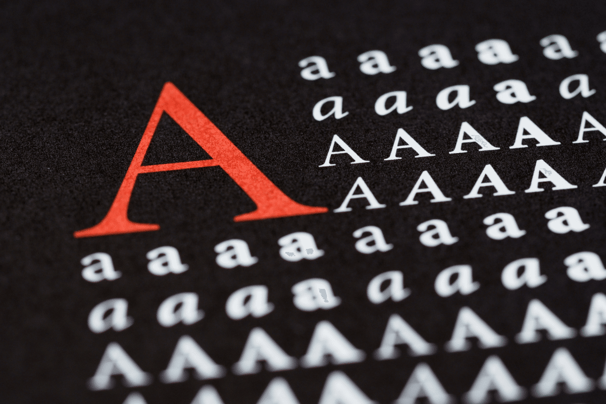
An accessible font typography is one that is legible, clear and understandable to the wider audience disabled or not. Generally speaking, It should not slow down the reading speed of a website visitor.
Avoid using decorative fonts such as hand-written, cursive or custom made. When choosing an inclusive font it is important to choose one that is simple and unembellished.
Here are some key features of an accessible font:
- Lowercase and capital letters should be clearly distinguishable
- High contrast ratio between the font and background
- Characters such as o, e, a and c are not similar
- Increased spacing between characters
- No overlapping characters or letters
- Wide characters
Here are some examples of accessible fonts:
- Arial
- Tahoma
- Verdana
- Calibri
- Rockwell
Keep in mind that when choosing an accessible font it is important to consider how it will look on different displays and resolutions such as a tablet or phone. Some fonts are easier to read on bigger displays than smaller ones. And the font should be optimized for mobile viewports and screen readers.
Displaying text with images is generally not recommended, firstly because screen readers are unable to read aloud text on images, and secondly when those images are scaled for different resolutions the quality deteriorates making it harder to read.
Using a smaller font size isn’t recommended if you’re planning on making your website accessible. This can cause eye strain and give a cluttered look, resulting in a negative user experience. You shouldn’t make your font size too big either, opting for a medium sized font is advisable.
Running A/B tests and trying different font sizes across web pages is another great way to find the optimal font size for conversion by tracking analytics and user feedback.
Scaling Accessible Fonts with Em and Rem Units In CSS
According to the Web Content Accessibility Guidelines (WCAG) it is recommended to use relative font sizes instead of absolute when designing a website. This can be done using CSS em and rem units when setting units of size, both are relative and scalable units.
- em is relative to the nearest parent element’s font size.
- rem is relative to the root element’s or the html’s font size.
While rem units are easier to work with and more predictable in general, since they follow the root element in terms of font size. It lacks flexibility if we need to only scale and control a certain area of a web page.
em on the other hand is more modular and offers detailed control over specific areas of a web page since it follows its nearest parent font size.
em and rem units offer more flexibility when modifying the visual representation of a web page.
They both have their pros and cons when it comes to scaling font size on a webpage.
The Benefits Of Accessible Fonts?
Most of the information found online is conveyed through text, and this is important especially if you’re selling a product or offering a service to your customers.
The value proposition and messaging of your business has to be clearly understood by your customers and this starts with an accessible font.
Inclusivity with your content also means more potential customers since you’re targeting an underrepresented and often untapped segment of the market. This also makes website visitors satisfied and increases browsing sessions which is tracked by Google Search when assessing for SEO score and performance. Conversion and engagement rate is also significantly higher with accessible web pages.
Not being inclusive with your textual content puts you at risk of losing brand trust and endangers your reputation. And this translates into lower customer conversion rate and sales.
Using accessible fonts is also part of the Americans with Disability Act (ADA) compliance guidelines, and not following them puts your business at risk of a lawsuit and being sued for an ADA violation which can go up to $75,000 for the first violation.
Conclusion
Accessible fonts play a crucial role in the digital accessibility landscape. It ensures that everyone experiences content the same way without any barriers in readability and legibility, disabled or not. From choosing a clear and legible font to choosing the right font size, both are important factors in web accessibility.
Opting for an accessibility font benefits businesses and website users alike, by creating an inclusive and comfortable digital environment for both parties.